Designing money products people trust with the things they can't afford to lose.
Results, not just pixels.
I'm a digital product designer working to provide business solutions through design thinking and methodology.
Most of my last 4 years have been spent on money-lending, payments, cards, business banking, cross-border, KYC/KYB, savings and etc. It's a fast paced domain that pushes creativity and punishes ambiguity, which is why I love it.
That means I'm the person on the team who closes the gap - the one who can wireframe in the morning, prototype it by lunch, and ship it by Friday without compromising quality of design or code.
More about me →What people I've worked with say.
{{ q.quote }}
Recommendation from {{ q.first }} goes here.
Selected work
Case studies across payments, savings, lending, cards and brand.
Speaking & community
Talks, panels, judging and mentorship across the African design community.
Follow on LinkedIn ↗More updates are shared on LinkedIn.
See all on LinkedIn ↗Articles and Insights
Thoughts on design process, inclusive UX, design systems, and the craft of building products people love.
View all on Medium ↗All articles are published on Medium in the Bootcamp publication.
Read all articles on Medium ↗Hi, I'm Joyce.
Digital product designer, Mentor, Community manager, and Interactive Design student.
Based in Dublin, Ireland.


Results, not just pixels.
I'm a digital product designer working to provide business solutions through design thinking and methodology.
Most of my last 4 years have been spent on money-lending, payments, cards, business banking, cross-border, KYC/KYB, savings and etc. It's a fast paced domain that pushes creativity and punishes ambiguity, which is why I love it.
That means I'm the person on the team who closes the gap - the one who can wireframe in the morning, prototype it by lunch, and ship it by Friday without compromising quality of design or code.
The room, stages, food, events, community, friends and hobbies that shape me as a person
Community lead. I organise meetups, workshops and events for designers in Abuja.
Talks, panels and one-to-one time with designers early in their careers.
Talk to users, support and ops. Find where the money flow actually breaks.
Turn the mess into one problem statement the whole team can align on.
Flows, states and edge cases first, then the interface and the system behind it.
Prototype, test, hand off or build it myself, then iterate on what users do.
Building a remittance brand from the ground up.
Brand, mobile product and website for the UK–Nigeria corridor, the specific context this app was built to nail first, before expanding further. No pressure, no stress, save more.
Where it started
When I joined this project, there was already a logo, a PRD, and a CEO who wanted to talk things through properly. We spent real time on the why. Why the name Velvet, what it should feel like in someone's hand, what it should never feel like. That conversation is where everything else in this case study starts.
Exploring the problem
Nigerians and other Africans in the diaspora send money home constantly, and there are already good apps doing this, and this isn't a story about a broken market. The people we were building for specifically are the working, middle-aged Africans in the diaspora: people putting in real hours for their money who still need to send a chunk of it home, reliably, without it costing them more than it should.
Our edge wasn't "we invented remittance." It was cheaper rates, real transparency, more ways to send, and an onboarding process that doesn't feel like a chore. No pressure, no stress, save more. That's the whole promise in one line.
That's the question every decision after this one traces back to: how do we make sending money home feel fast, simple and fair, for people who don't have time for anything less?
The business goal
Underneath the personality, Velvet had a very specific commercial job: give working, middle-aged Africans in the diaspora a real reason to choose Velvet over the apps they already use out of habit: cheaper rates, real transparency, and onboarding that doesn't feel like paperwork. That meant trust and simplicity had to be felt immediately, in the first ten seconds, not the tenth screen.
With the goal clear, I went deeper into the PRD the PM had already prepared, and we ran sprints on the flows. I used Figma Make to create major screens and moved on to clickable wireframe prototype on each major screens, not polished, just structurally right. I sat with stakeholders around that prototype, stress-tested the logic, and revised it until everyone in the room agreed on the flow. Only then did brand and visual design begin.
Creating the solution: finding "Baked"
With the flow agreed, I needed to know what Velvet actually looked and sounded like. So I explored two full directions with Claude, built out as complete systems with palette, type, voice, motifs, buttons, not just moodboards.
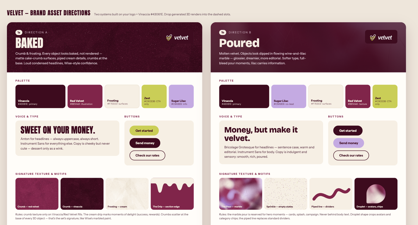
Both were built on the same core palette pulled from the logo, just expressed completely differently. I presented both to the team, and "Baked" won, hands down. It had more personality, more nerve. It didn't look like it was trying to be a bank.
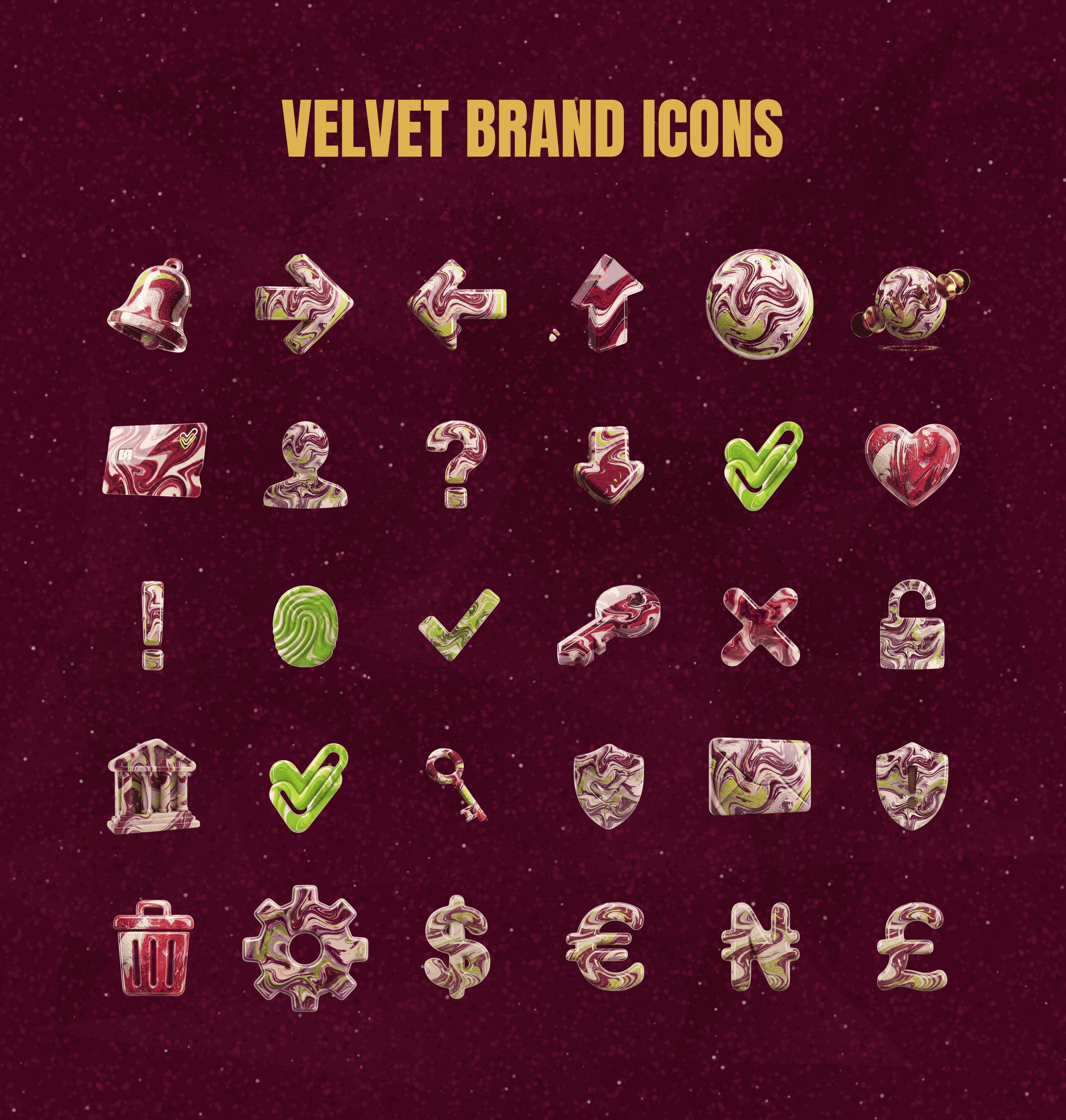
From "Baked," I built out a full icon set using Google's Flow AI, applying the same crumb-and-marble texture applied across dozens of icons, from arrow icons to the 3D version of the logo to currency symbols. They turned out beautiful, and they carried the brand best in motion, especially across the splash and onboarding screens, where a single icon does most of the emotional work before a user's even created an account.
Building the product, module by module
From there, the product came together one module at a time. Each one was designed, then reviewed weekly with the team specifically to hunt for edge cases and unhappy paths.
Then: the website
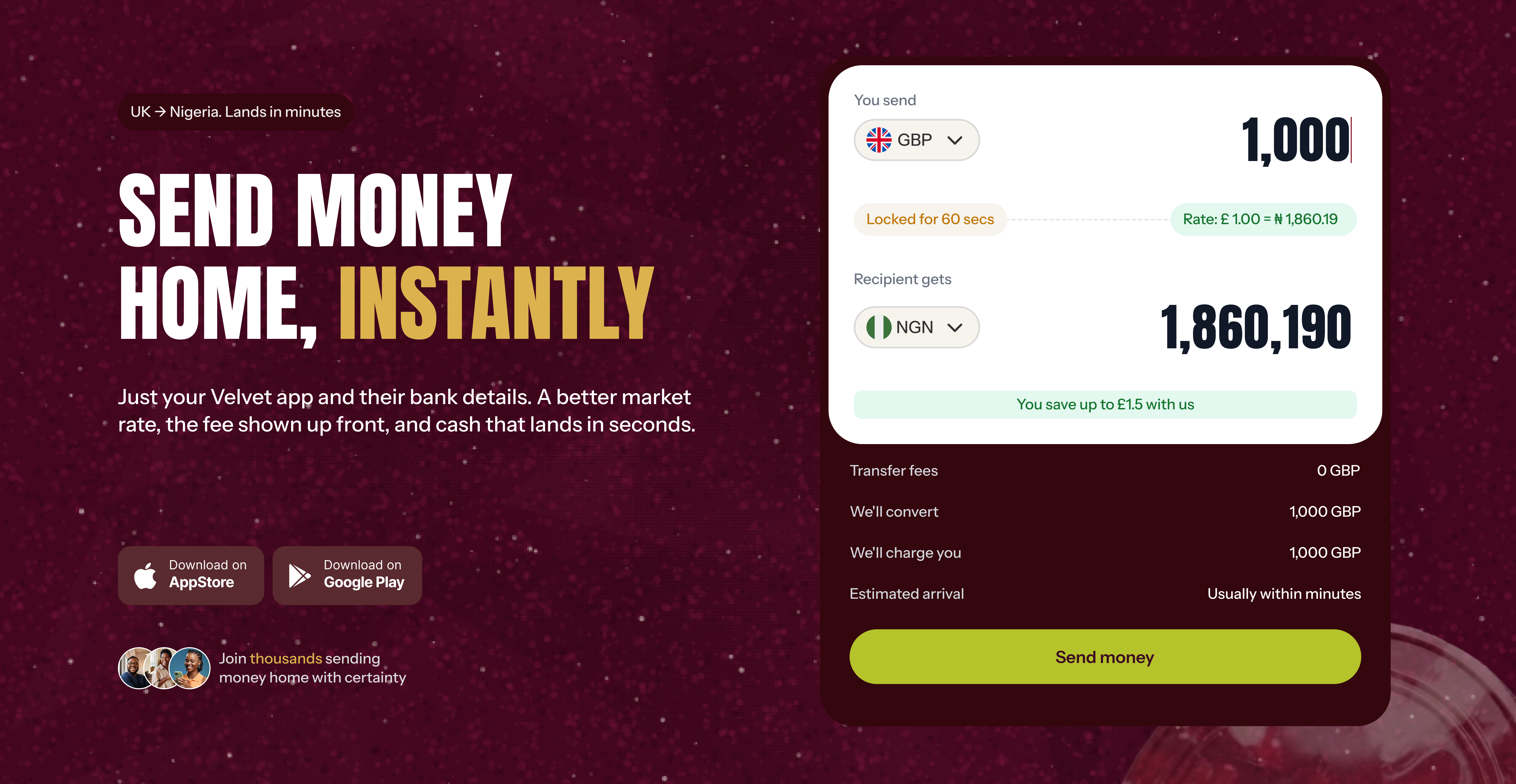
Once the product system was solid, the website came next, same brand, different job. The core promise of cheaper, more transparent and less stressful shaped the homepage directly.
Send money sits front and center, not buried under scrolls of brand storytelling. Land on the page, see an amount field, see the conversion happening immediately.
We also made sure the ways of sending were visible and flexible, either from a Velvet wallet, or through open banking with a UK bank connected via Plaid. Different people trust different flows, so we built for both.
What testing caught
QA didn't just catch bugs, it caught entire missing flows. A few paths we thought were finished had gaps once real testers tried to break them, and we fixed and iterated quickly.
Some of the strongest changes came directly out of this stage:
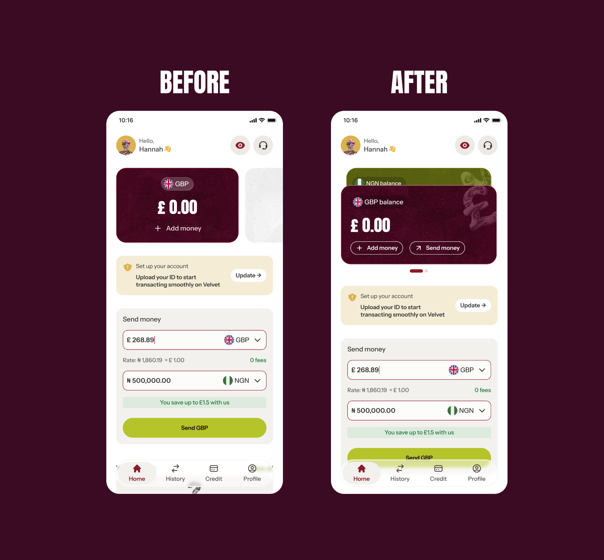
The homepage card went from static to swipable. A small change, and a big difference in how the top of the page felt
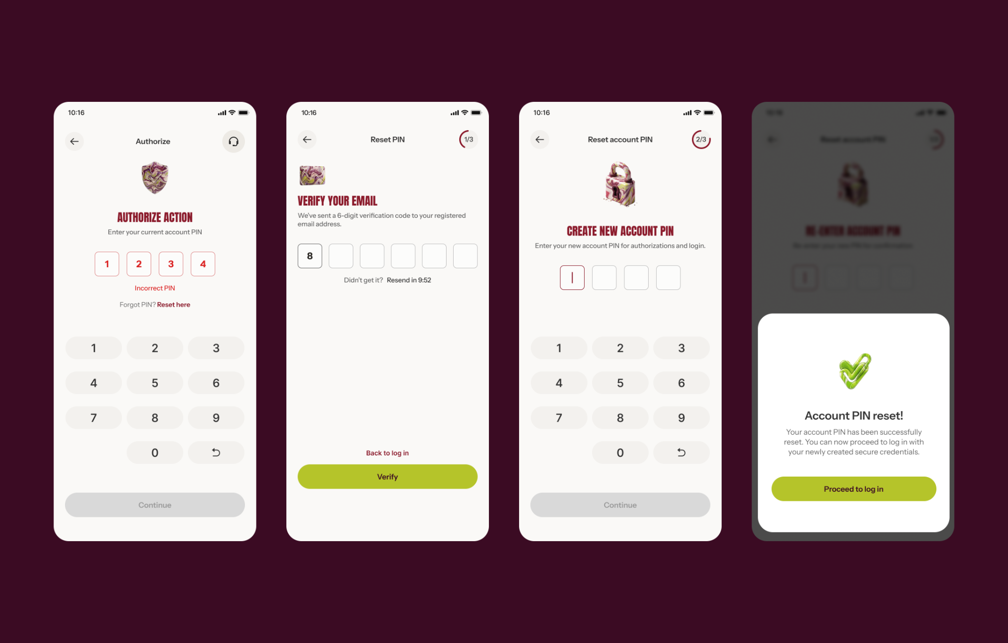
Fixed the PIN change/reset flow after testers got stuck
Adjusted KYC flows based on requirements from verification partners
Coming soon: topping up via GBP directly, one of the most requested additions
Impact
Velvet has just launched, so the real numbers are still coming in, but the groundwork is exactly what it needed to be: a brand with actual personality, a product built module by module with edge cases taken seriously, and a homepage that gets straight to the point instead of making people hunt for it.
Reflection: where this leaves me
Where this project stretched me was in the overall design direction: taking something vague from the brand and turning it into something creative and consistent.
It had me wearing the art director's hat, advising the CEO on the look and feel of the brand, and onboarding the graphics designer into the system so it held up beyond me.
It also made me far more comfortable and efficient with AI tools, using them to work faster and wear multiple hats at once.
Pots: making USD savings feel alive.
A savings feature letting Cleva's USD holders fund and withdraw anytime, with a live per-second earnings counter.
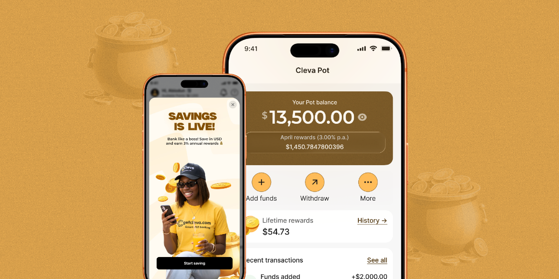
Making saving effortless for USD holders
Pots is a savings feature I designed at Cleva that lets users save part of their earnings in USD and grow it through daily rewards. The first version was intentionally simple: a way to gauge reception, measure actual demand, and get real feedback on the kind of savings direction our users would prefer, so we weren't just designing another savings feature without evidence. Cleva had over 1.5 million users at the time, and savings was one of the most requested features, so the questions worth answering were which shape it should take, not whether to build it.
Two months after launch, 14,000 users had opened a Pot, saving a combined $80,000. The feedback on social media was some of the most positive we'd seen for any feature that year.
But the Pot story isn't just about being a feature launch. It's about how much thinking has to happen before an interface can be simple, and how a "simple" feature can still be one of the hardest things to design well.
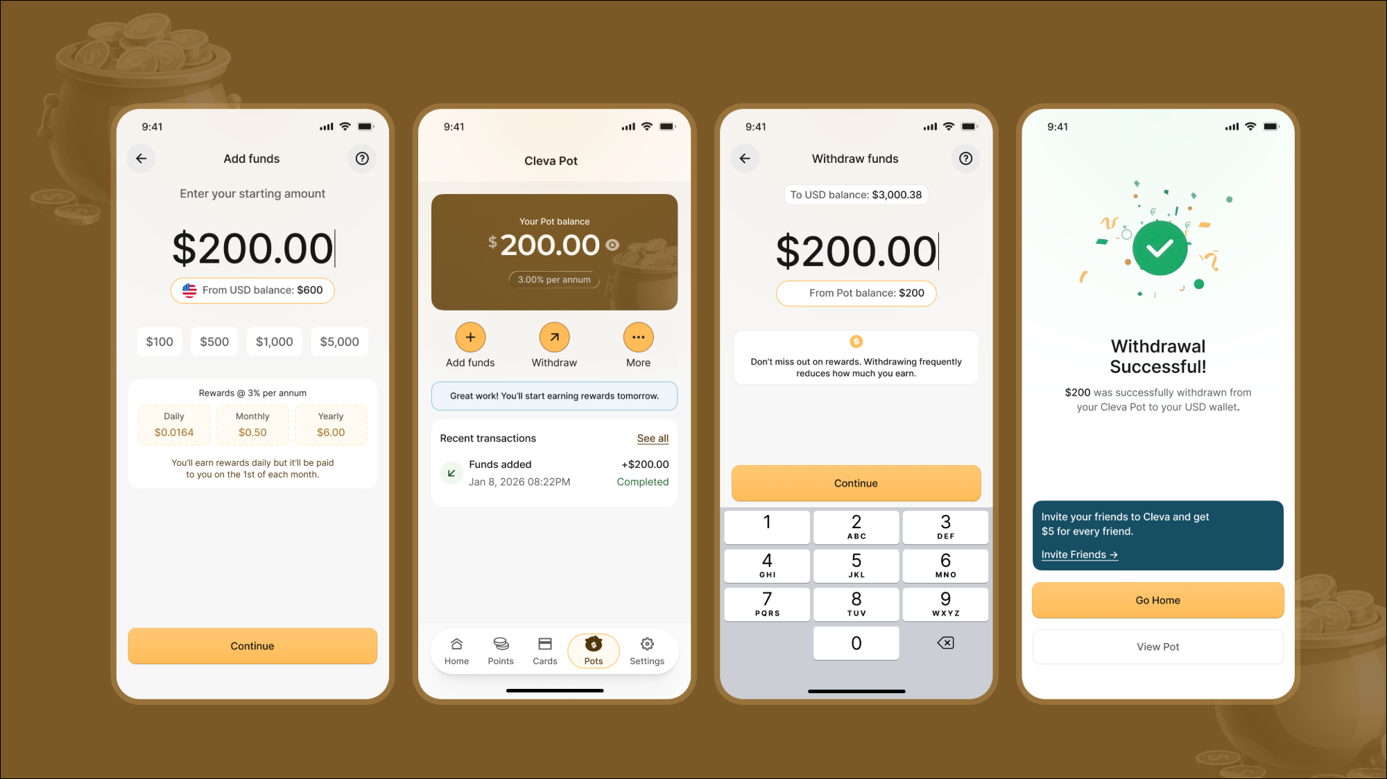
The problem
Cleva users were already holding and spending USD on the platform, but they had no reason to keep money sitting there beyond what they needed for immediate spend. Users had been asking for a way to save directly, so we wanted to give them a low-friction way to do it without asking them to trust us with anything complicated upfront. No lock-in periods, no penalties, no fine print. Save when you want, withdraw when you want, and earn something for leaving your money in.
That last part, earning something, was where the real design problem lived.
Research first
Before any screens were drawn, we spent time understanding how our users actually thought about saving: what made them trust (or distrust) a savings product, what they expected to see before committing money, and where they'd abandoned similar features elsewhere. That research shaped a simple principle we kept coming back to for the rest of the project: people will save if they can see the maths, and they'll stop trusting a product the moment the maths feels hidden.
That principle is what made the rewards system the hardest part of this project, not the UI.
The hard part: designing a reward system people could trust
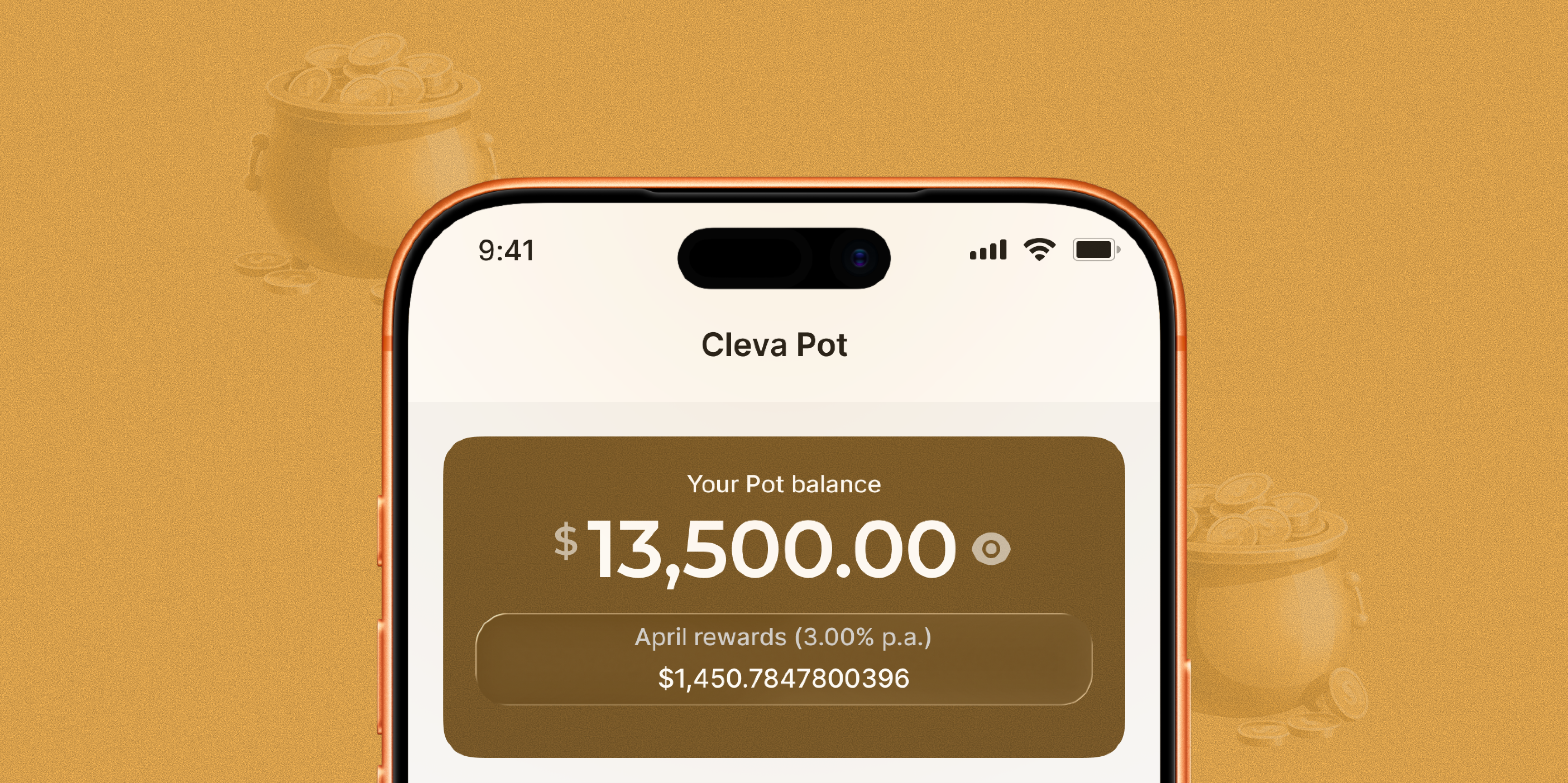
The mechanic itself was intricate. Rewards accrued per second, in the background, based on a user's balance and rate. They were accumulated daily and paid out into the Pot at the end of the month. This is a normal way to structure interest, but it creates a genuinely difficult communication problem: how do you show someone a number that's technically always changing, without making it feel abstract, untrustworthy, or like a marketing gimmick?
We didn't just design the "happy path." We mapped out every state the reward could be in and designed for each one deliberately:
We built a live, readable representation of earnings accruing, so the "per second" mechanic felt tangible rather than theoretical, without displaying a jittery number that would undermine trust.
Withdrawing mid-month shouldn't feel like it erases progress the user has already earned. We had to decide, and clearly communicate, what portion of rewards was preserved versus forfeited.
A new deposit changes the base the reward is calculated on. Users needed to understand that their earnings would adjust going forward without feeling like they'd been reset or penalized for saving more.
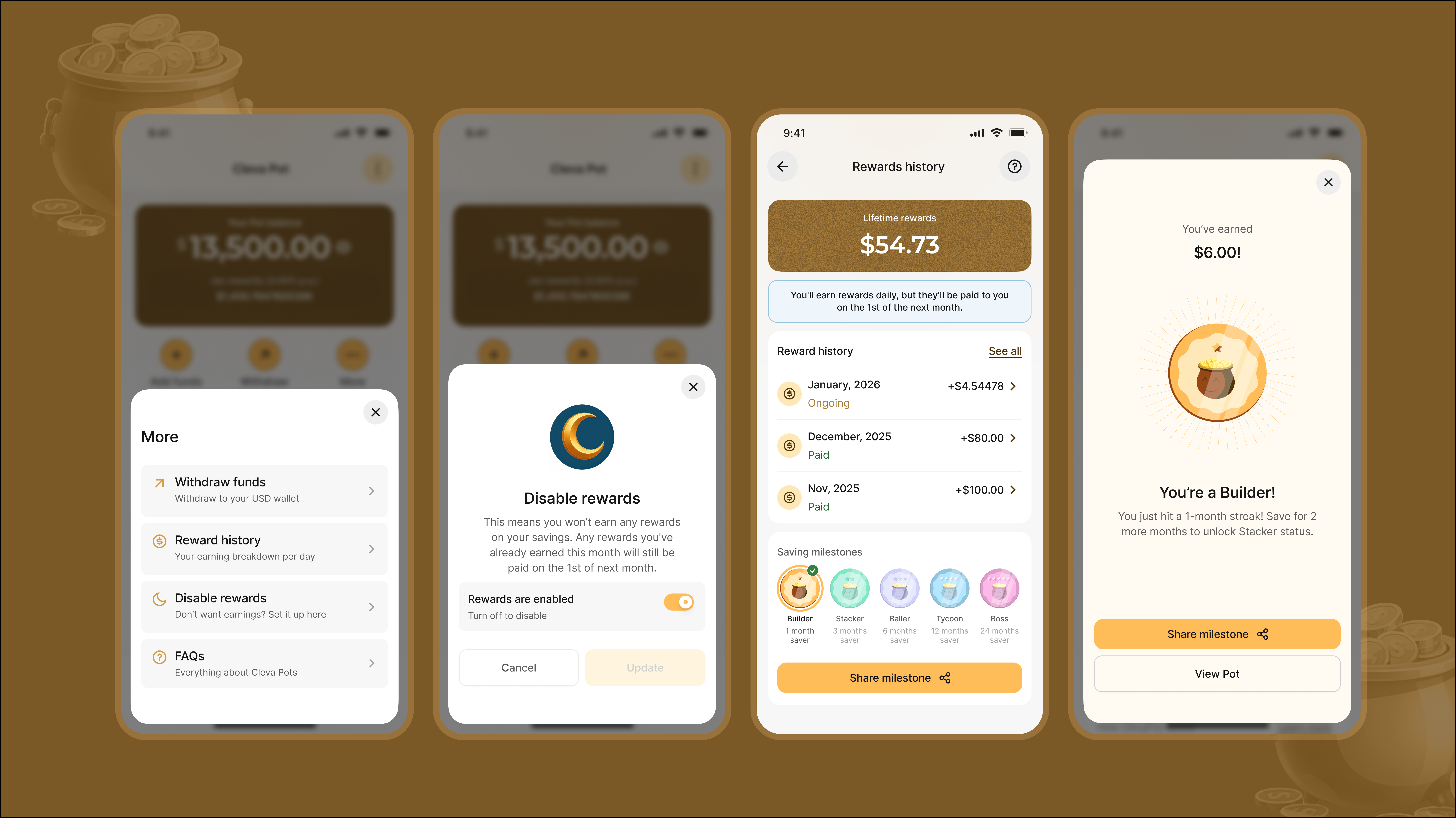
Rather than a single opaque number, we designed a breakdown view that let people see where their earnings were coming from and over what period, so "trust the maths" wasn't just a principle, it was a screen.
Some months, a user's accrued reward fell below the minimum payable amount and had to roll into the next month. This is the kind of edge case that's easy to skip in a v1, but it's exactly the kind of thing that erodes trust silently if you don't design for it. A user who sees "$0 earned" with no explanation will assume the product is broken, not that it's working as intended.
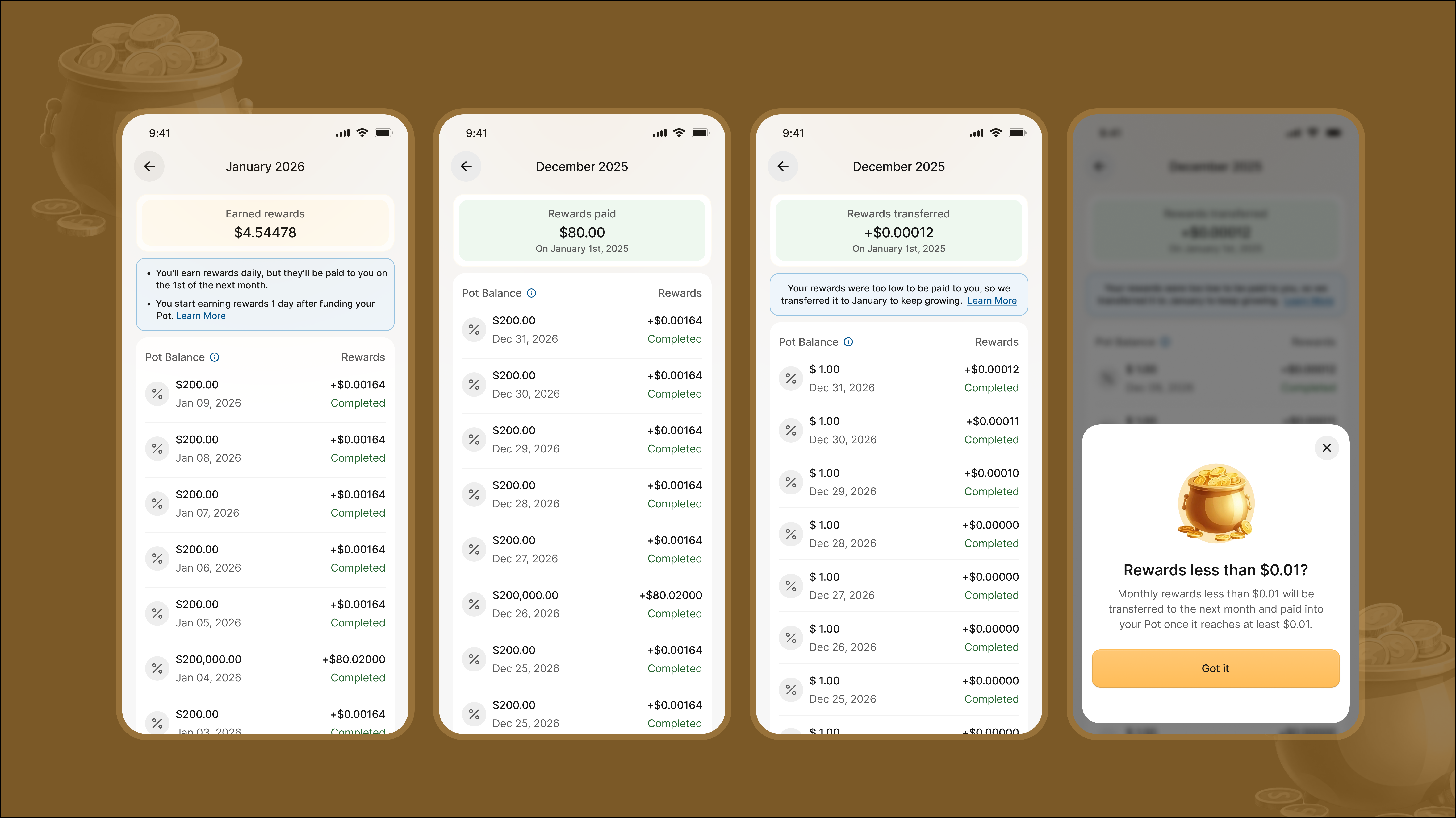
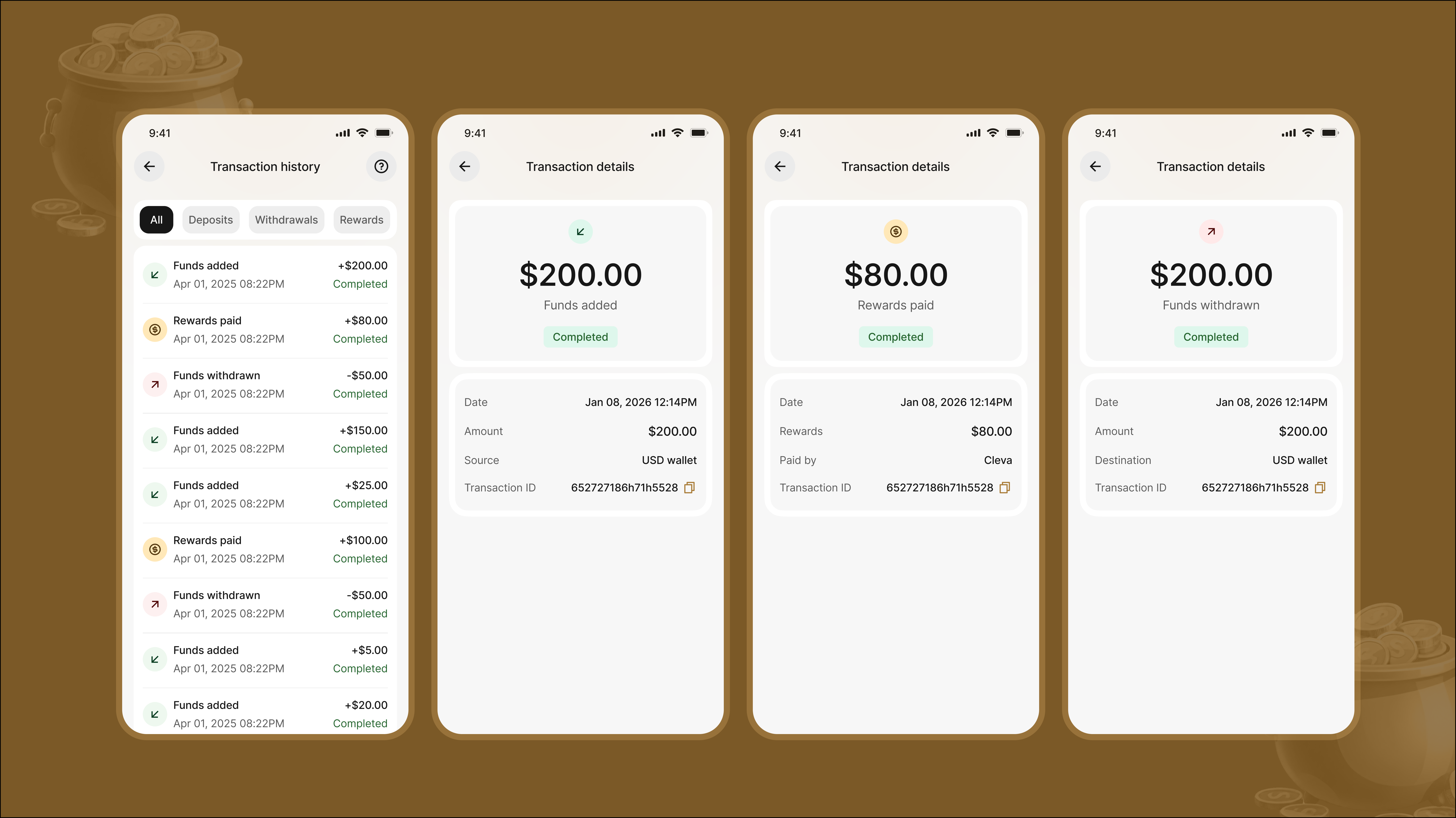
None of these are exciting to design. They don't make for flashy portfolio screenshots on their own. But they're the difference between a savings feature that feels honest and one that quietly loses people's confidence a few months in, which matters enormously for a financial product built on trust.
Testing before we trusted it ourselves
We validated in layers, not all at once:
Moderated internal usability testing after the first design pass, to catch confusion in how we were communicating the reward logic before it ever reached engineering.
A working demo with the engineering team, where we walked through the logic together, partly to align on feasibility, and partly because talking it through out loud with the people who'd build it surfaced edge cases we hadn't considered.
QA and internal testing after development, where we deliberately simulated edge cases: early withdrawals, top-ups mid-cycle, rewards below the payout threshold, to confirm the system behaved the way we'd designed it to, not just the way it was supposed to on paper.
That last stage mattered as much as anything upstream. A feature like this can look correct in a design file and still fall apart the first time real, messy user behavior hits it.
Results
users opened a pot within two months of launch
saved, with a growing percentage of 15% monthly
saved monthly on average, across two months
annual projection, yearly
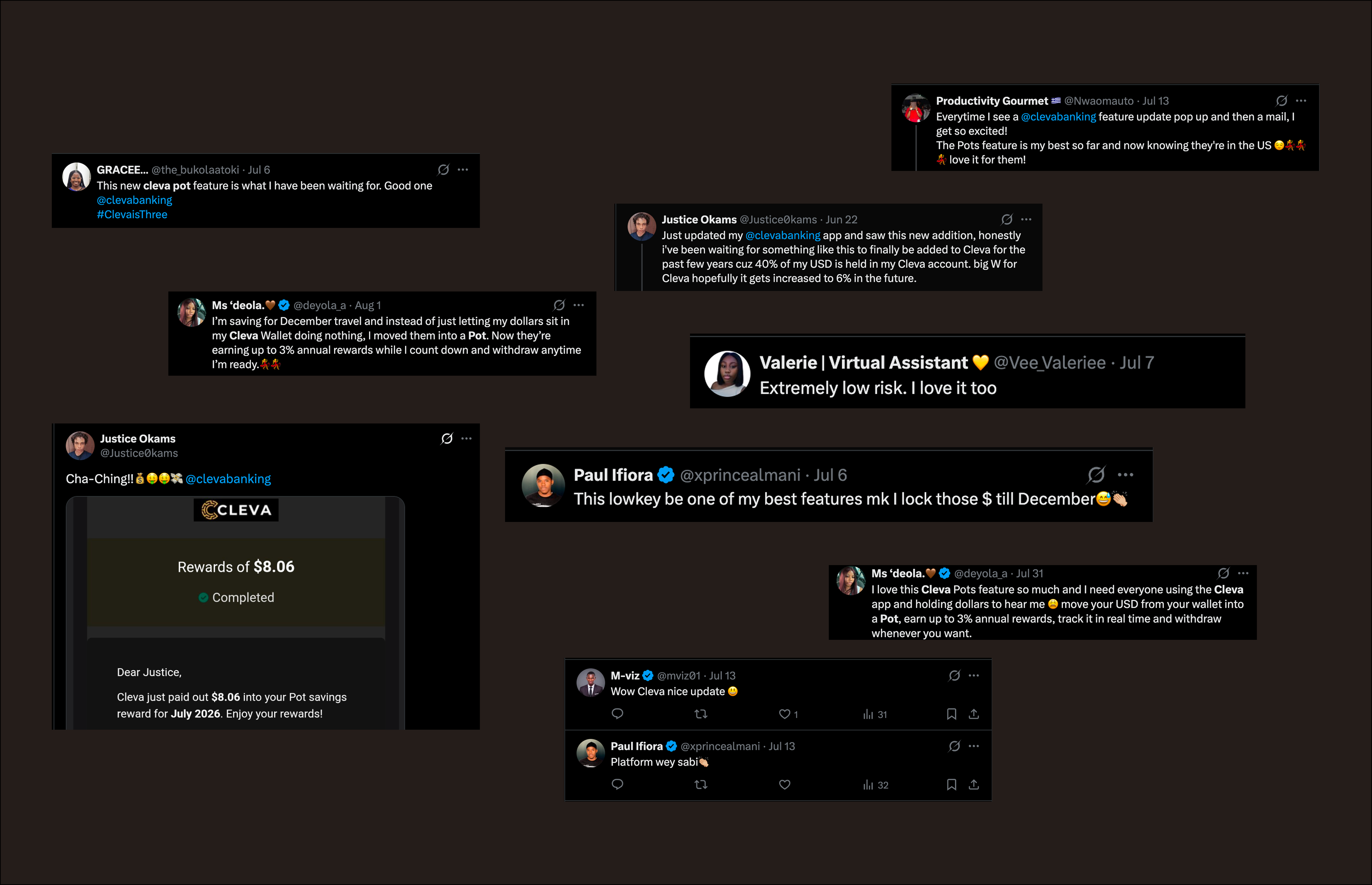
Consistently positive feedback across social media, with users specifically calling out how easy the feature was to understand and trust.
What followed
Pots launched as a v1 on purpose, a way to prove the demand before building further. Once it did, we followed up quickly with a series of iterations that took Pots from a single savings mechanic to something closer to a full rewards system:
Savings goals users could set and track progress toward
A savings option built around Sharia-compliant terms
Letting users save toward different goals at once instead of one general balance
Recurring, rule-based saving without manual top-ups
More in progress, working toward Pots becoming a complete reward feature for both individual users and businesses on Cleva.
What this taught me
The visible part of Pots, the save screen, the balance, the earnings counter, took a fraction of the time the invisible part did. Most of the month went into thinking through what happens at the edges: after a withdrawal, after a top-up, when the reward is too small to pay. Those aren't UI decisions. They're product decisions that happen to need a UI.
The lesson I keep from this project: a feature isn't simple because it looks simple. It's simple because someone did the work to make the complicated parts invisible, and then tested hard enough to be sure they actually were.
{{ s.heading }}
{{ p }}
{{ b }}
{{ h.t }}
{{ p }}
{{ h.before }}
{{ h.after }}
{{ p }}
{{ caseModulesHeading }}
{{ caseModulesIntro }}
{{ caseTestingHeading }}
{{ caseTestingIntro }}
{{ n }}
{{ caseTestingOutro }}
Impact
{{ p }}
{{ gp.lead }}
{{ it }}
{{ caseReflectionHeading }}
{{ p }}
{{ b }}
{{ caseReflectionOutro }}
Open to product design projects, tech events and community, mentorship and speaking opportunities.